Each week this year I want to share a mid-century house design. Many of these designs are small, in comparison to modern day homes, but they also have some great features that we can incorporate today. With new technology like flat screen tvs and lap tops, we really don't need separate studies or TV rooms, and smaller is definitely cheaper!
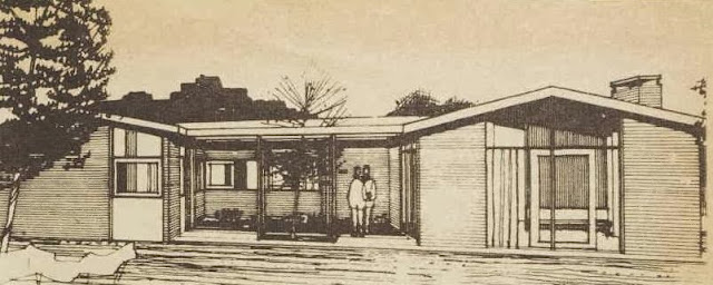
This home from the January 1962 issue of the Australian Women's weekly has a U-Shaped plan with a semi-enclosed courtyard separating living and sleeping wings.
The laundry is an extension of the kitchen, and you can imagine a carport or garage could be attached here for easy entry after doing groceries, as well as an undercover washing line for inclement weather. The dining area is conveniently located close to the kitchen, but not right in it, and that wall could be a feature brick wall continuing in the same material as the fireplace.
There are three large bedroom, and the largest bedroom has a walk in robe. Wouldn't it be lovely to wake up and breakfast on the terrace? And perhaps a swimming pool just off the terrace and living area - with light white furniture and orange and turquoise accents?
 |
| White metal outdoor furniture |


No comments:
Post a Comment
Your comments are very important to me and I read each and every one of them! Please leave your blog address so I can visit.