Showing posts with label art. Show all posts

Tuesday, 13 August 2013

Mid-Century Art - The Posters of David Klein

If you have been reading this blog for a while you will know that I have a little obsession with Zebras. (You can see some previous posts here.)  So when I found this image I just had to get myself a copy, and find out more about the artist.

African travel poster with zebras 1967 by David Klein


This Poster is one of many designed and illustrated by David Klein (February 23, 1918 – December 9, 2005), a native Texan, who is best remembered for his advertising work during the 1950s and 60s, especially for TWA.  This one was produced in 1967, which is a little out of my mid-century range, but it's till older than me so it's OK!

David Klein in his studio c. 1957
David Klein in his studio c. 1957 via

Tuesday, 6 August 2013

Mid-Century Style Art by Matte Stephens

I have been searching for some great mid-century style art for my dining room, and came across this illustration of Central Park.
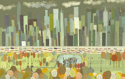
A view of Central Park. By Matte Stephens.
It's just what I am looking for, both style and colour wise.  It's also of somewhere I have been and have fond memories of.  I just love it!

The artist is Matte Stephens, who is based in Peterborough, New Hampshire, one of those small, picturesque American Towns popular with tourists, and home coincidentally of the Pulitzer prize producing MacDowell Art Colony. 

Matte has exhibited his work widely in the US, and counts among his customers Tiffany & Co., American Express, IBM and more importantly Herman Miller.  As well as being self taught and super talented, he also seems a really nice guy, who was happy for me show you his work - I did ask just to be sure!

Matte says that he loves modern design and is inspired by mid-century designers Charles and Ray Eames, Alexander Girard (textile designer), George Nelson, Irving Harper (think marshmallow sofa) and also artists like Ben Shahn and Paul Klee.  I love Klee's work, but hadn't heard of Ben Shahn (thanks for educating me Matte!)

Much of Matte's work features city's such as new York and Chicago, but also overseas cities such as Paris, Sydney and Melbourne.  I was in Sydney recently, and this painting captures the best bits of the city.

Sydney. Matte Stephens.

Some of Matte's other work is just plain funny.

Capturing the bear in his natural habitat.  Matte Stephens
Capturing the bear in his natural habitat.  Matte Stephens.
With their witty titles they're like the readers I had in grade school, only much cooler.  In fact matte has actually illustrated a couple of books for early readers.

Mr Flux children's book illustrated by Matte Stephens
Mr Flux, via
Foolish Fox children's book illustrated by Matte Stephens
The Foolish Fox, via
As well as foxes, Matte also obviously loves cats.

Cat Bird. 8.5 x 11 print by Matte Stephens.
Cat Bird. By Matte Stephens.
And has a great sense of adventure.

I shot an arrow into the air, they fell to earth in Berkeley Square. Matte Stephens.
The colors he uses are more muted than some mid-century style work around, which I quite like.  You can find him on Etsy, which is where I found these images.  They are quite affordable (from $35), and originals and various size prints are available.  I think I need quite a few.  Don't you?

Deb xx

Friday, 31 May 2013

Fashion in Art

I have been a little slack in my blogging here of late. Sorry. It's because I have started another blog (yes, crazy I know) and my energy has been going in to that this past week. I will still keep up with this blog, for all my history, vintage mags, fashion and movies, but my other blog is about interior design and decoration, past, present and future. It's what I trained in, and hope one day to go back to, so I though it was time I caught up with the latest trends, had another look at design history, and kept a record of great ideas.  If you want to check it out, please head to HOME LUST.

Anyway, today a look at some more 30s vintage fashion in art - in a portrait by one of my favourite 1930's artists - Tamara de Lempicka.

Tamara de Lempicka - Portrait Of Mrs M. - 1932

This painting was done in 1932, and the shape, colour and sheen of the dress really reminds me of this dress by Bruyère from 1931/32 - with the tie tied at the front rather than the back.

   White satin dress by Bruyère from the 1930s

What do you think?

Deb xx


Monday, 20 May 2013

Fashion in Art - 1935 Gown & Cape

Today's painting is Portrait of a Young Woman, painted in  1935 by Meredith Frampton.

Frampton, 1935
The sitter was Margaret Austin-Jones, then aged twenty three. Her dress was made up from a Vogue pattern by the artist's mother. The vase, made in mahogany, was designed by Frampton himself, and he said he made this painting as 'a relaxation from commissions, and to celebrate an assembly of objects... beautiful in their own right'.  

The dress is a little like this one (available on ebay).

1935 Vintage Sewing Pattern
But the fuller skirt is more like this one.

May 1935.
The caplet top maybe separate from the dress too.  Caplets and small capes to hip  length were popular in the 30s, like this Cape and Dress from about 1931 by Jean Patou.

Cape and Dress, c. 1931 Jean Patou
This is a sweet day dress pattern with a similar cape.

1930s Dress and cape pattern
I found a little black cape recently at the op shop ($3). I think it's going to be perfect next time I go out on a chilly autumn night!


You can see more of Meredith Frampton's work here.

Deb xx


Monday, 13 May 2013

Fashion in Art - Jersey

I've decided that since not much is happening with my wardrobe at present (although I did wear 30s style lounging pyjama pants yesterday) I would start looking a bit at fashion in art - maybe a different vintage painting each week.  

To begin, is this portrait of Peg Oldfield from 1931, painted by Australian artist Douglas Dundas (1900-81).  This painting hangs at the Brisbane Art Gallery. Peg Oldfield was an illustrator, and probably moved in the same circles as Dundas in Sydney.

Peg Oldfiled by Douglas Dundas, 1931
 She has a very modern look for 1931, with her Coco Chanel inspired outfit of patterned jersey blouse and pulled down beret or turban. I say jersey as the fabric looks to thin to be knitted of wool and the drape at the elbow looks more like jersey than silk or cotton. And the pattern looks very similar to this one.

Coco Chanel wearing one of her designs, 1929
Coco Chanel was the first designer to use jersey for outerwear. During the fabric rations of WWI jersey, which has only really been used for underwear, was the only readily available fabric, and Chanel experimented with it, creating women's suits and blouses and skirts. It was easy to wear and comfortable, as well as being easy to launder.  Not everyone accepted jersey for outer wear, but many did, and the jersey suit became Coco’s first real success in fashion.


Madame Gres and model, 1938
Madame Gres (who I have looked at in an earlier post) worked from the 1930s through to the 80s, and made many of her fabulous gowns in jersey.  She also often wore her trademark beret or turban. The perfect hat for a bad hair day!

Deb xx


Saturday, 13 April 2013

Australian Travel posters of the 1930s

You will have seen by previous posts that I love 1930's travel posters.  The French posters are incredible, and there are also some great American posters.   Today, though, I am featuring Australian Posters from my home state of Queensland.  In the 1930s the Queensland Intelligence and Tourist Bureau commissioned a range of posters by Eileen Mayo, Percy Trompf and James Northfield to attract holiday makers from the south to the 'paradise' in the north.  You may remember Paul Hogan's 1980's 'Put another Shrimp on the barbie' campaign, or seen the more recent 'Where the bloody hell are you' campaign. Personally I preferred the thirties, when all you needed to make a lasting impression was a nice beach, some pineapples, a cute girl and some fish.

via


via
via
I imagine the the bright, colourful, optimistic pictures had wide appeal, especially during the Depression.   and in the 1930s his posters attracted lots of attention overseas.


via

This poster is very similar to WWI and WWII recruitment posters - just imagine he's saying "where the bloody hell are you!"

via
My favourite poster is this one, produced in 1935 for the Queensland Government Tourist Bureau.   ‘The Sunshine Route’ includes various destinations such as Brisbane, Gympie, Great Sandy Island, Maryborough, Bundaberg, Gladstone, Rockhampton, and my home town of  Mackay.


The artist Percy Trompf (1902-1964) was born in Victoria, Australia and began his commercial artistic career designing confectionery packaging. He also designed thousands of advertising posters but the widespread recognition of his posters for the Australian National Travel Association and the Victorian Government Railway is probably what he is most known for.

Do they make you want to visit?

Deb xx

Tuesday, 19 March 2013

13 Stunning 1930s orange and blue travel posters


My recent flight to Brisbane has inspired the traveller in me, and I found some stunning 1930's travel posters in my favourite colour scheme at present - blue and orange!  This colour scheme really works for travel destinations don't you think - blue water, blue sky, orange castles and sunsets........

Monte Carlo, 1930s

French travel poster, 1930s
French Riviera travel poster, 1930s
1930s Greek travel poster
German travel poster, 1930s
1930s Mediterranean travel poster
1930s Anchor Line poster
Casablanca travel poster, 1930s
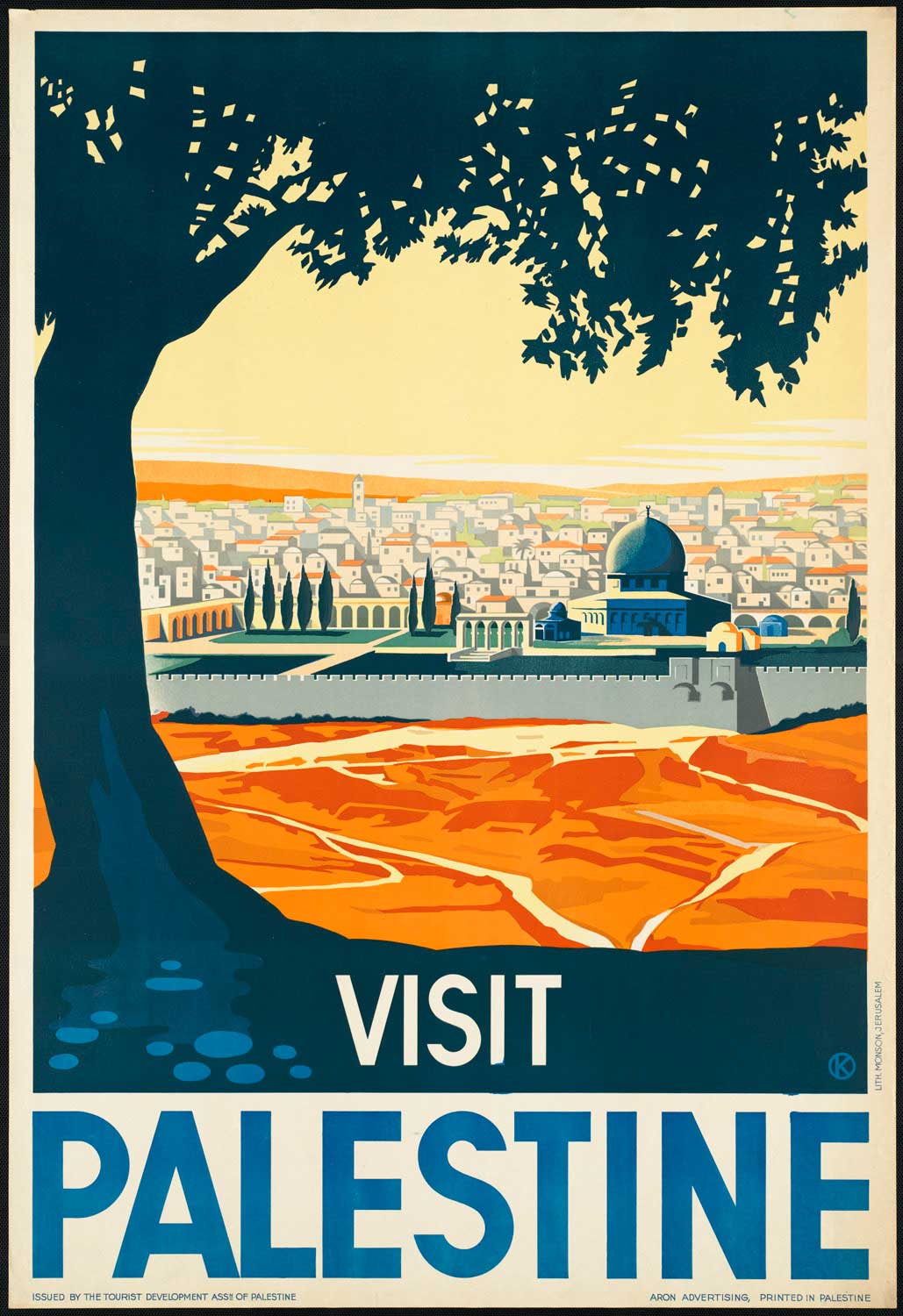
Palestine travel poster, 1930s
Mornington/Kodak travel poster, 1930s

 Loetschberg railway Blue Lake bernese alps 1930s poster

Garda, Italy travel poster, 1930s

1930s Florence travel poster
I'm not sure which is my favourite, what about you?

Deb  xx


Thursday, 14 February 2013

A Vintage Valentine 1913 Style


Happy Valentines Day one and all !

I am back at work a few days a week now, and helping at school when I can, so my posts may be getting a little shorter, or maybe less frequent, for a while.  So today, just some Valentines Day images from 1913.

 source
source


source


source

source
The above images are what I imagine of 1913 - dreamy, romantic, pretty.  This sculpture, The Kiss, was made by Konstantin Brancusi in 1913, one of his series of sculptures from  “The Kiss” series that he did from 1907 – 1925. Looks like it could have been carved today, don't you think?


Don't you love this romantic ad for Pet Milk, also from 1913. Mmmm, I wonder what's its made from?!

source


Oyster fritters, there's a lovely suggestion for a valentines day treat! And lastly, some words of wisdom from 1913 - The Dos and Don't for husbands and wives, by Blance Ebbut. You can find the books here, but to sum up:
source

Don't s for Wives reminds women not to flirt with other men in case they succeed "better than you want to. It is like playing with tigers and edged tools and volcanoes all in one".  I'll try and remember that!

 Have a wonderful day, whether you're eating oyster fritters, flirting, spending time with your loved one, or sitting on the couch with your favourite ice-cream or the cat,

Deb xx